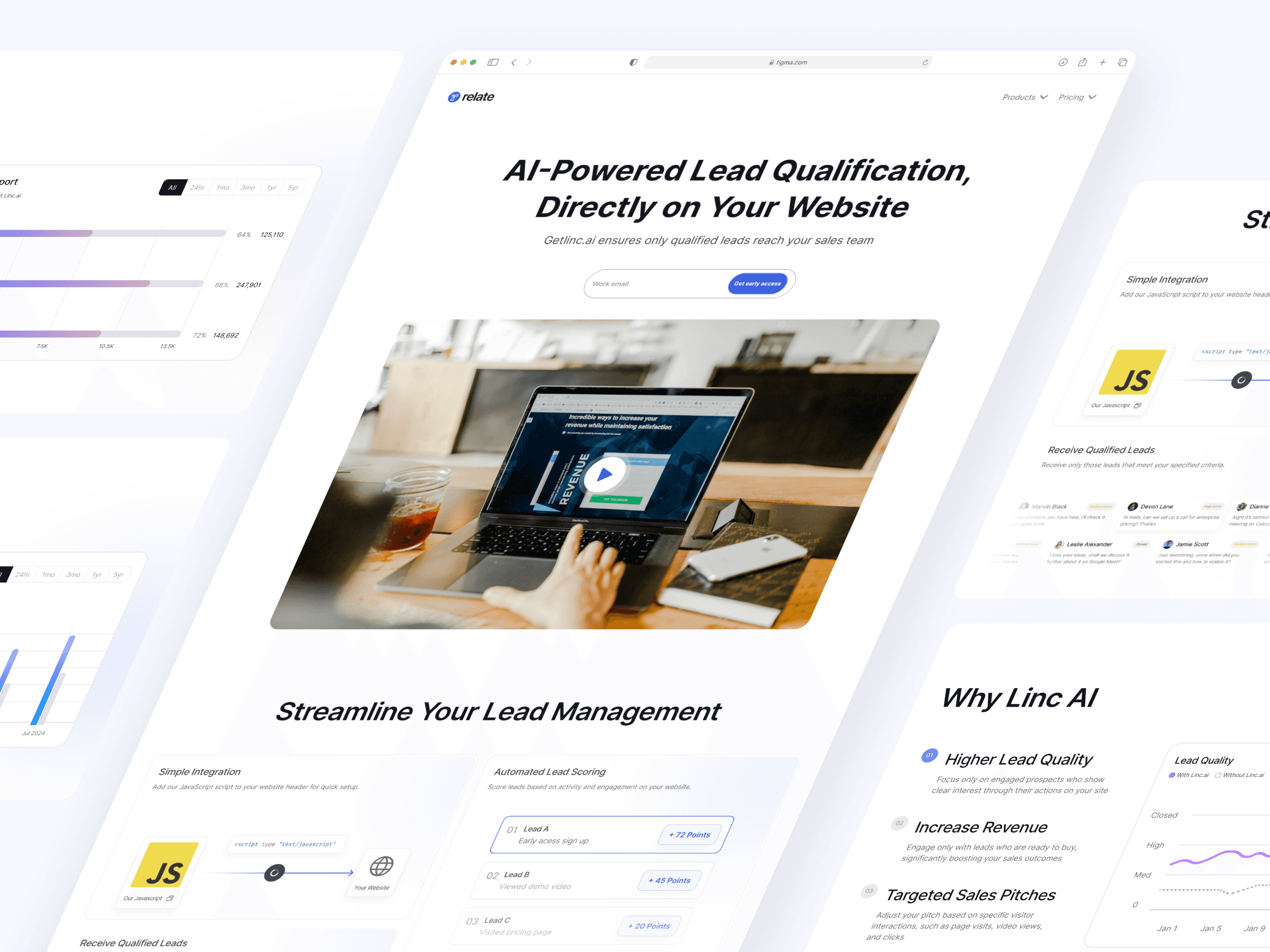
Client name
Michelle Marcelline & relate.so
Role
UI & UX Designer
Industry
SaaS Lead Qualifier
Software used
Figma & Framer
Overview
Business Problem: The founder had this great idea for lead qualifier software but wasn’t sure how to present it to salespeople through a website.
Outcome: We came up with a website concept that showcases Getlinc.AI’s unique selling points (USP), focusing on the features and how the software can make salespeople’s lives easier.
Impact: We successfully translated the Relate.so founder's idea into a landing page that clearly communicated why users should choose Getlinc.AI.
Learning: Learnt to make a website concept directly from no code design tool which is Framer. And being flexible to client's needs where in this case I need to put framer website into Figma designs.
The key players
There are 3 key players on this project which is Relate.so Founder as the client, Michelle Marcelline as the Middle-man and me as the UI/US designer. Simply here is how the communication for this project.

Before we started, I sent the project brief to Michelle, who then passed it to the Getlinc.AI founder. This ensured that both Michelle and I were clear on the project scope, the number of screens to design, and the desired motivations and actions of the users.
Making Lead Qualification Faster for Salespeople
Our target users are salespeople. Right now, our sales team reaches out to everyone who visits our landing page, but not all visitors have a strong intention to use our product. This approach makes it hard for our salespeople to focus on the prospects with higher conversion potential.
Getlinc.AI aims to help salespeople qualify their leads so they can concentrate on those who are more likely to convert. For a bit of background, Getlinc.AI is a sister company of Relate.so, a modern sales CRM for B2B companies.
My Role in this Project
As the UI/UX designer, I worked with the middleman for daily project updates and user interface iterations, starting with Framer and later switching to Figma at Getlinc.AI’s request.
The Issue: Delayed Launch by the Founder
Phase 1: Understanding the Brief and Overall Process
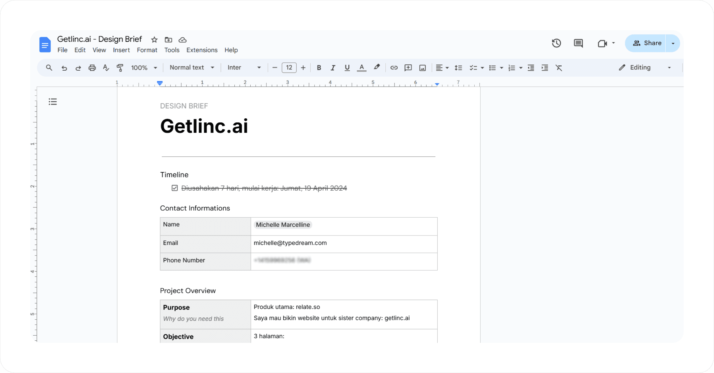
On the first day, after getting the brief from Michelle, I quickly went through the business profile, desired motivations and actions, and user personas to get a good grasp of the company. We agreed to complete the project within a week, using Framer to make the website live instantly. Below is the snip of what the brief looks like
Phase 2: Reference Gathering & Designing on Framer
Once we settled on the project details, the fun part began: gathering references and designing the website on Framer. I started by collecting references from the Relate.so website for style and colors, and I also checked out similar websites on Dribbble.
Phase 3: Migrating to Figma, Finishing the Style Guide, and Handoff to Michelle
Initially, everything went well. I provided daily updates to Michelle, who gave me revisions—just the usual client-designer interactions. Then there was a delay in her responses for a few days. Later, she informed me that the client, the Relate.so founder, decided to focus on his main business first and wanted only the Figma file, not the Framer website.
On the last day, I replicated the Framer website into a Figma file, added a style guide for a finishing touch, and handed it off. By the end, we successfully translated the Relate.so founder's idea into a landing page that clearly communicated why users should choose Getlinc.AI.
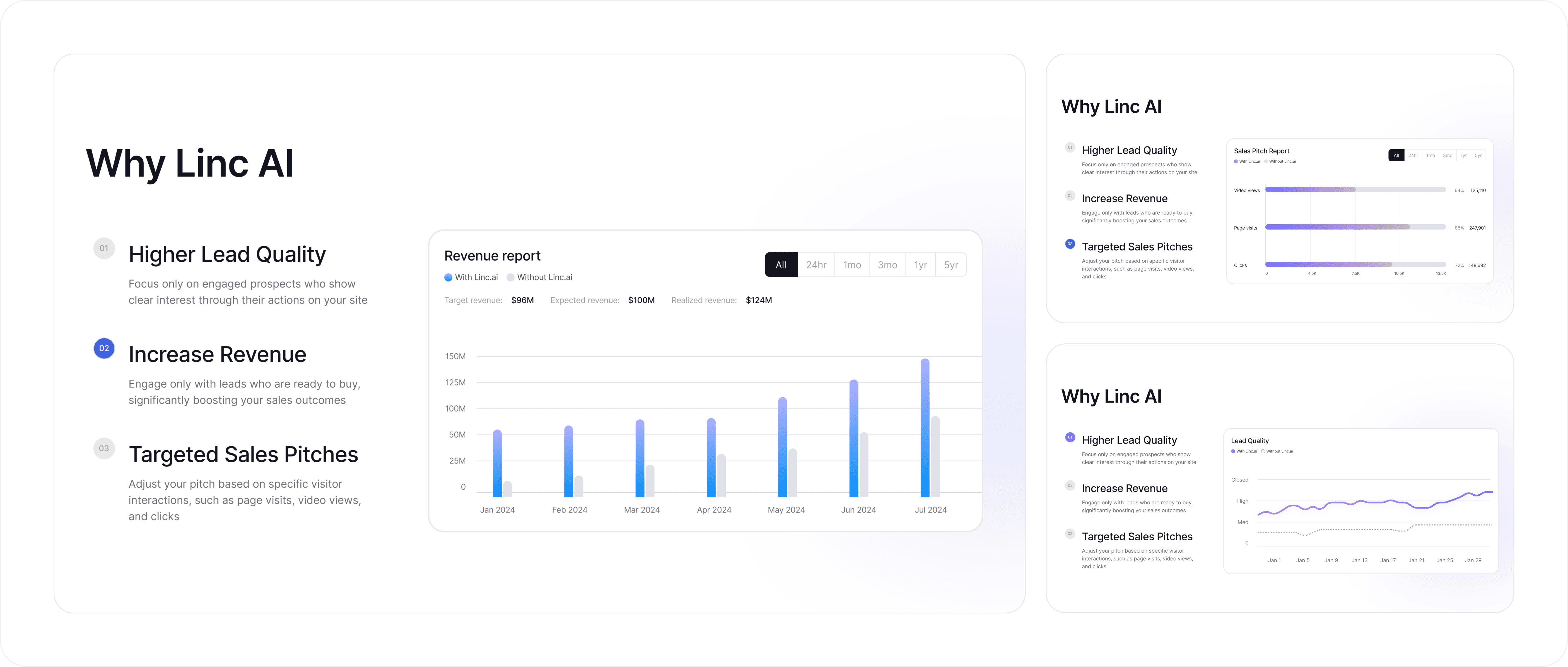
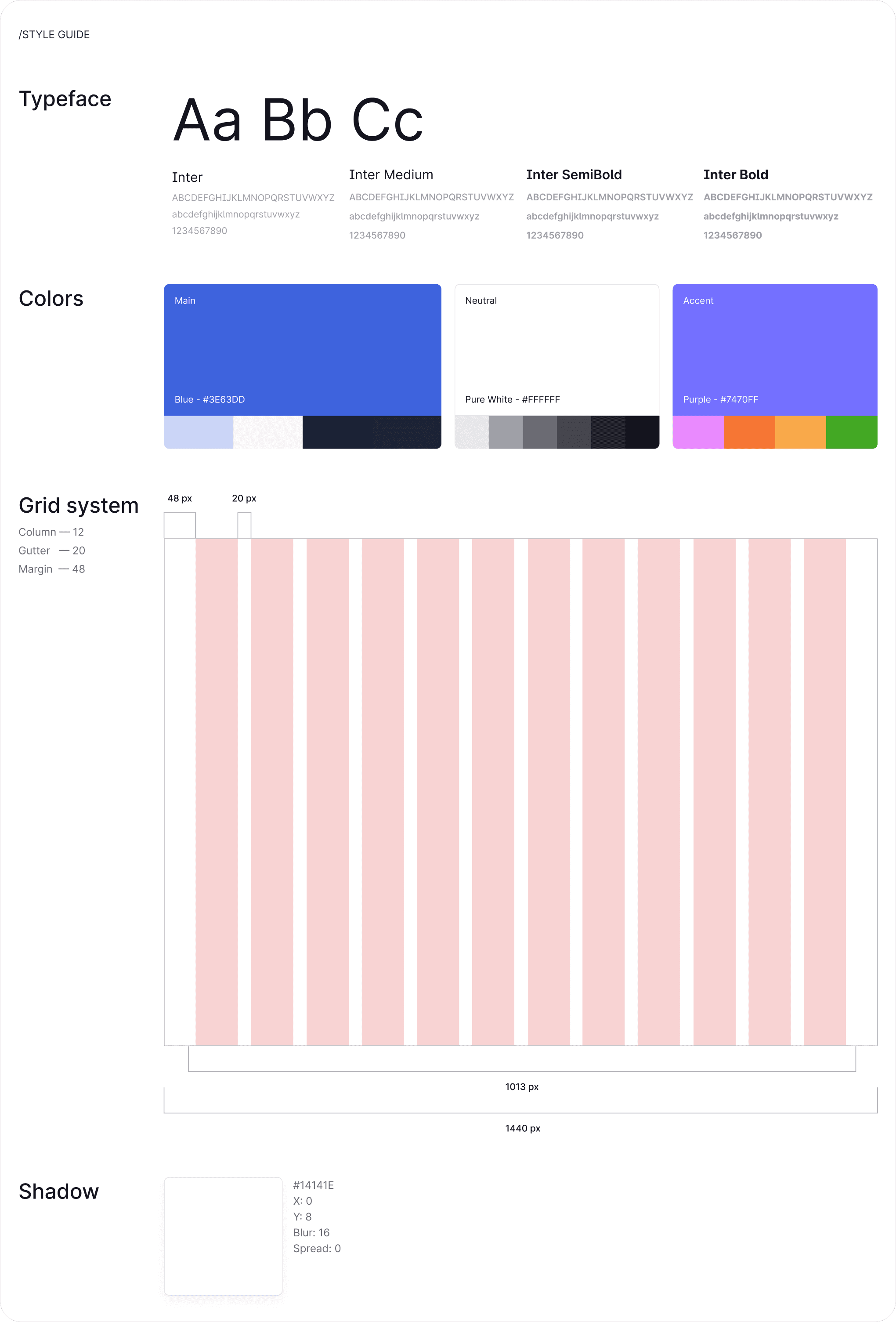
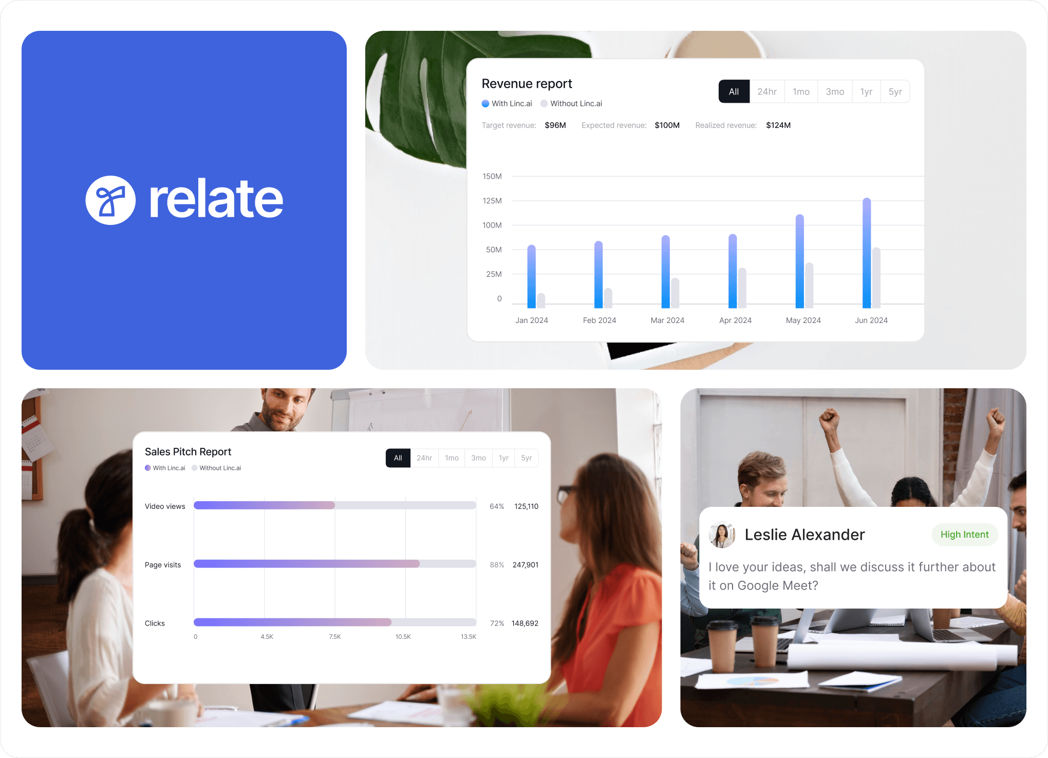
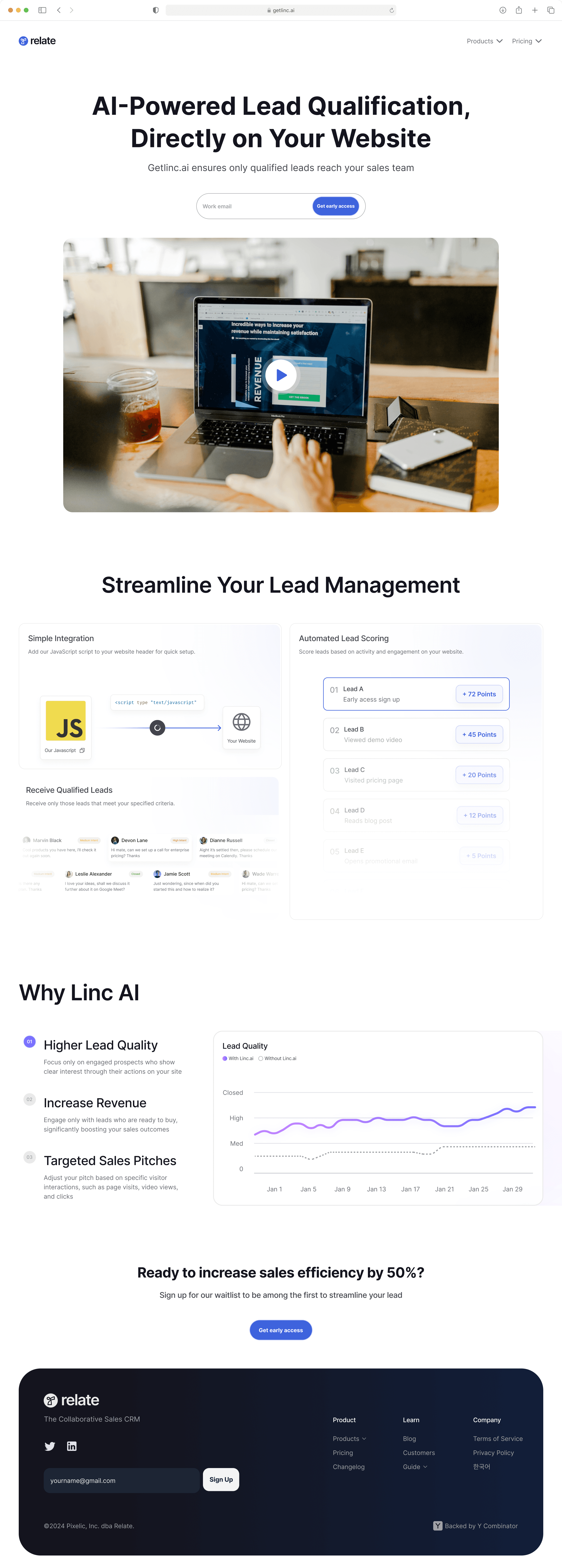
Below is the graph illustration, style guide and the full landing page created for Getlinc.AI.
Graph Illustrations
Style Guide
Full Preview
🤩 Client's feedback
"Michael was responsive and consistently provided daily updates, which was a significant plus in our project's progress. While his dedication was apparent, gaining more experience through working with various clients could enhance his understanding of web design best practices, such as effective use of placeholders and layout adjustments."
Michelle Marcelline - Co-founder @Typedream - Collected with Tally.so
