Client name
Apiary Academy X Design Jam Indonesia
Role
UI & UX Designer
Industry
Travel
Software used
Figma, Maze
What’s the Problem?
The main problem in this case is usually people run out of seat slots when ordering a ticket even though they are already on the payment page. Which results they must repeat the steps from the beginning and look for another train schedule.
After a while thinking about what is the possible root cause of this problem, i found that the possible scenario is users usually in a hurry while ordering a ticket because they enjoy their vacation too much and forgot that tomorrow or today, they must return.
Aside from the main problem, there are 3 pain points stated which are:
Users struggle to find a train schedule that fits them.
Limited seat slots and frequently runs out of slots when ordering ticket.
Users frequently rush when they are on the payment page because they are afraid of losing seat slots.
So, after knowing that this might be the root cause of this study i decided to conduct desk research to know a common train ticketing mobile app flow and made up some features in my mind that can possibly fasten the process for users.
There are 2 features that come to my mind to solve this problem, which are pushing buy ticket notification and a date slider in case they mis-input date of departure because in a hurry.
In here i picked 3 travel mobile app best practices which are Traveloka, Tiket.com and KAI Access. I choose this three mobile apps because this apps are the most popular app used by Indonesian users.
For finding the flow of Traveloka and Tiket.com i used Chamjo.design meanwhile for KAI Access i tried the app by myself. By analyzing the flow of each app, i can conclude that they have the same flow and i use that flow for my design. The user flow of the can be seen below 👇

Building up concepts
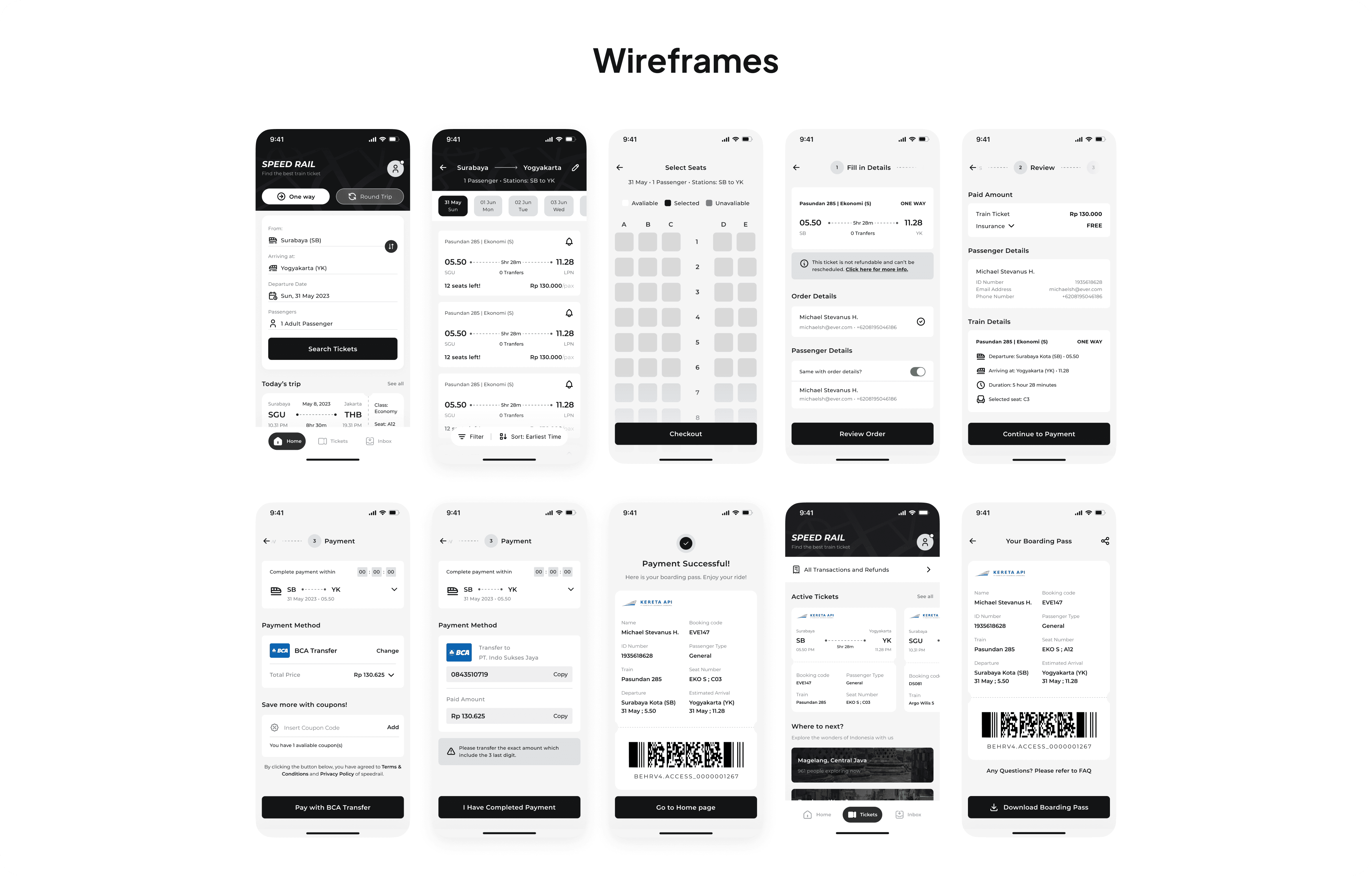
After finishing user flow above, i made several wireframe concepts to be implemented into high fidelity solutions.
The wireframe concepts can be seen below, and it covers 1 flow which is from the start (Home Screen) until user finishes ordering and gets the ticket. There are also 2 additional screens which are the ticket screen and boarding pass screen, but they won’t be used in this case study.
Designing Solutions
After i made the concepts above, i made several adjustments from the wireframes to be implemented into Hi-Fi design solutions. Adjustment that i done is mainly on the font spacing. Without further ado let’s dig in into the solutions below.
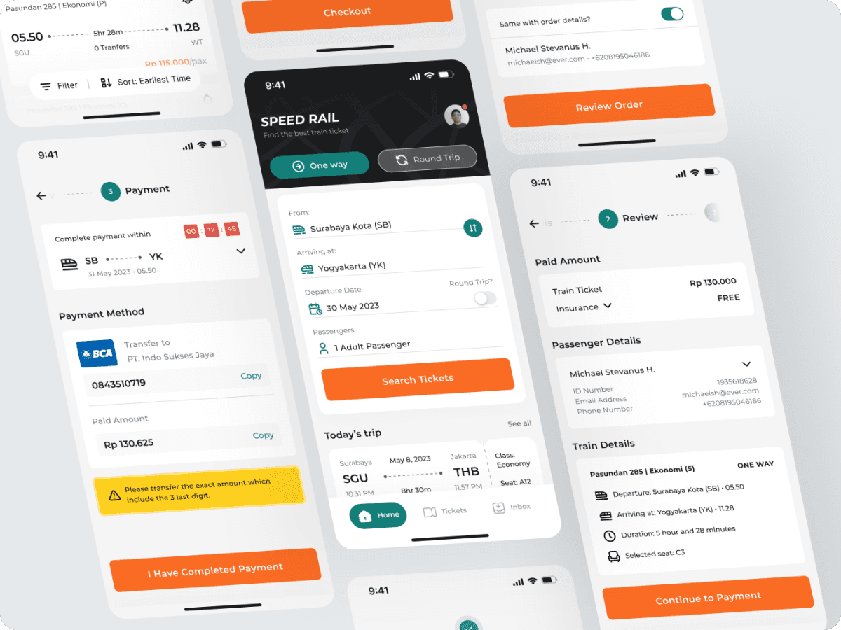
Solution 1, Easy Search System
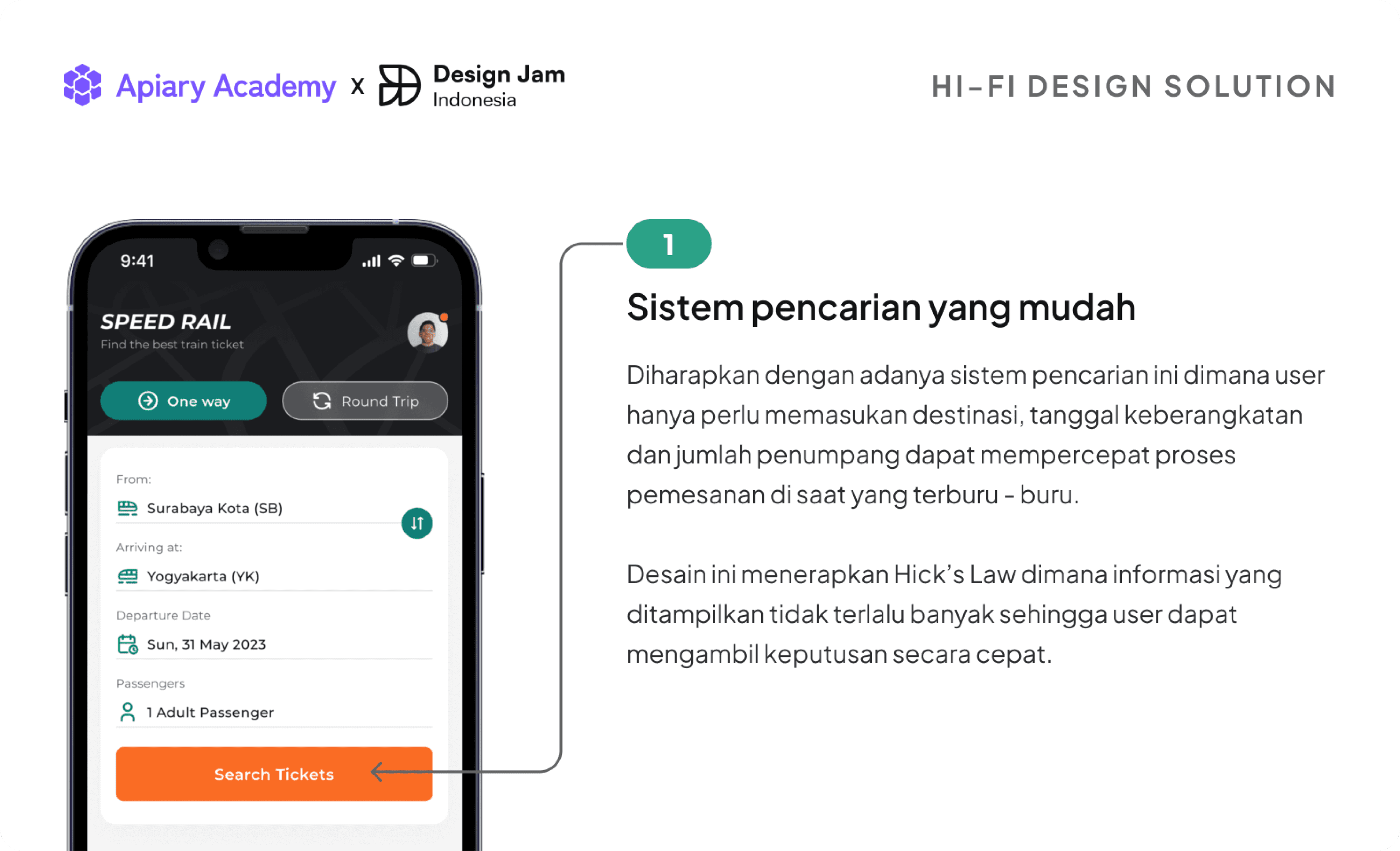
Explanation of the solution in Indonesian (1)
Hopefully with this search system where users only need to enter their destinations, departure dates and number of passengers it can speed up the ordering process in times of rush.
This design applies Hick’s Law where Hick’s Law simply means that the information displayed is sufficient not too much and not too little, so that the user can make decisions quickly.
Solution 2, Date slider and bell notification icon for desired ticket.
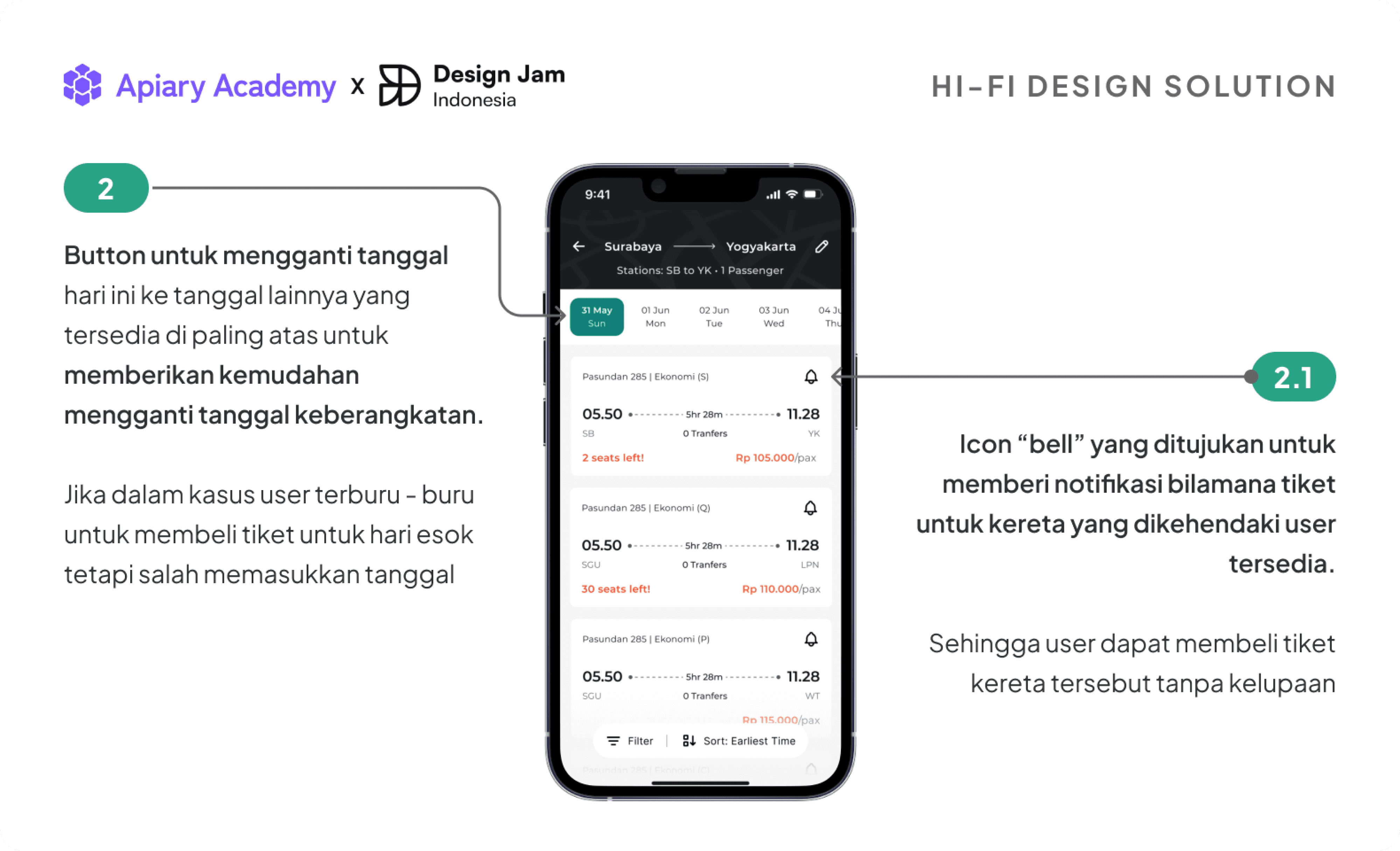
Explanation of the solution in Indonesian (2)
For the second solution because the scenario of this case study is for hurried users, the problem that may arise is they enter wrong date data because in hurry. Responding to the issue i offer a solution which is to add a date slider at the very top of the screen between the main information and available trains, so it can ease the user if they mis-input the date data.
In this page also i give a small bell icon beside train name and class which signifies notification. The solution here is the bell icon is used for giving notification to user if the desired ticket is available, so users can buy the ticket without worrying about forgetfulness.
Solution 3, Seat reservation system.
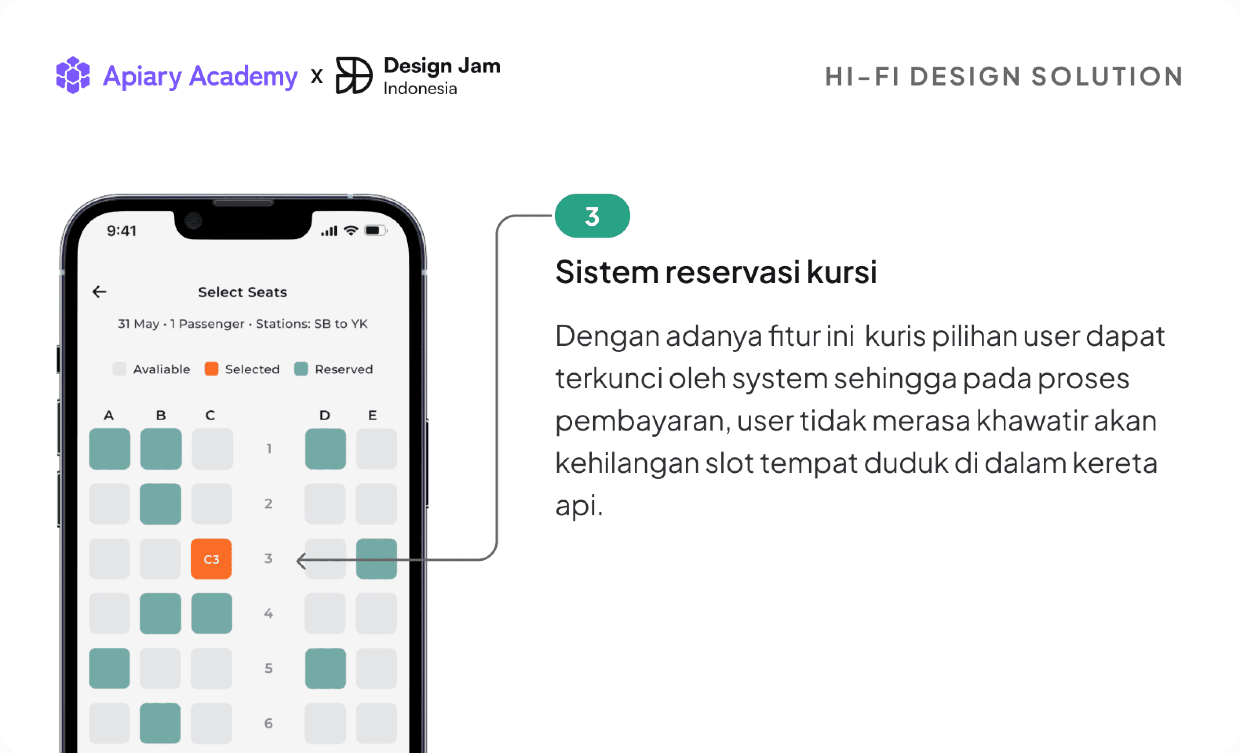
Explanation of the solution in Indonesian (3)
In this solution users can reserve first where they would like to sit whether it’s beside the window, in the middle or beside the aisle. With this feature the user’s preferred seat can be locked by the system so that during the payment process, the user does not feel worried about losing a seat slot on the train.
Solution 4, Switch to synchronize with order details and one way text
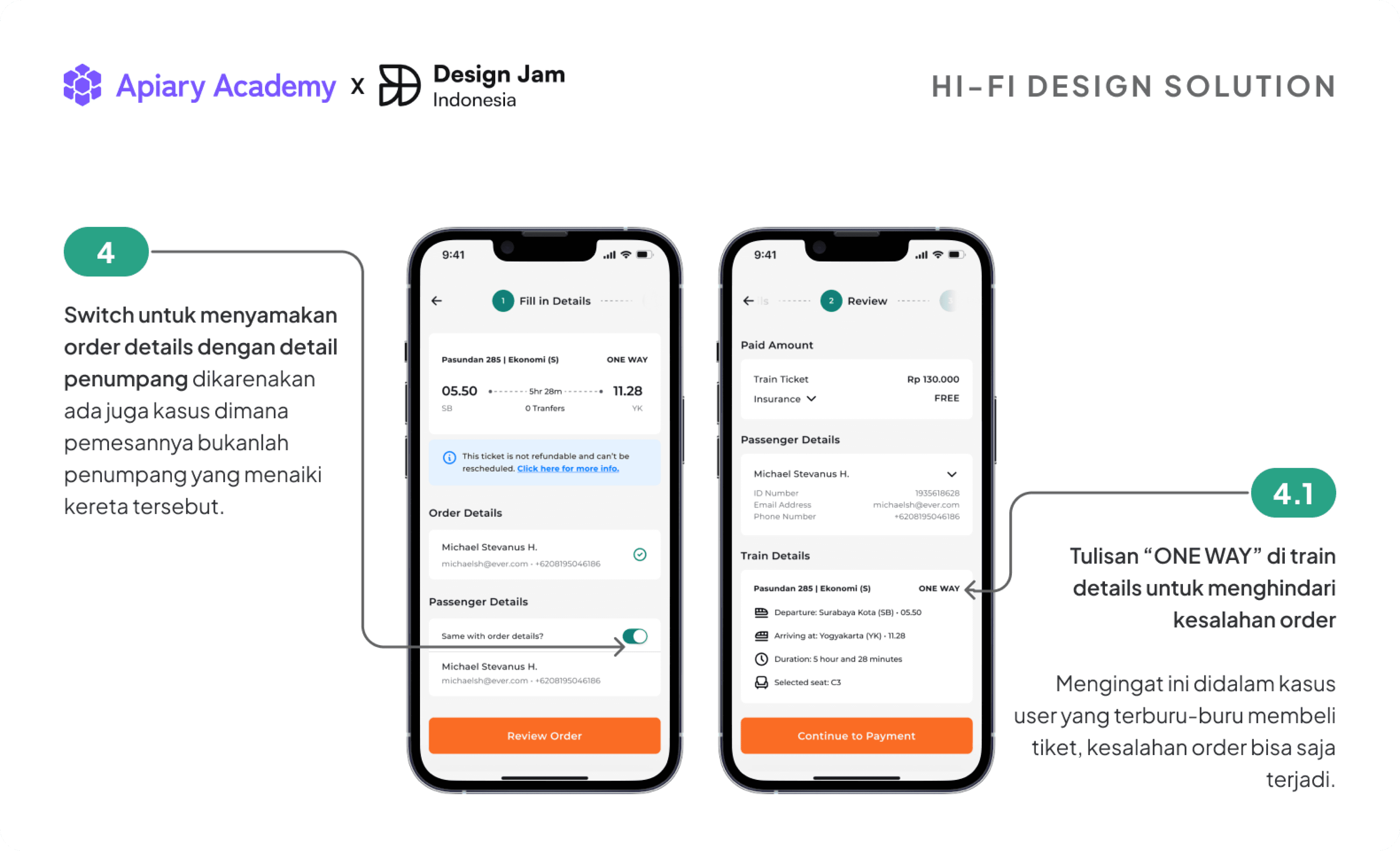
Explanation of the solution in Indonesian (4)
The first solution focuses on efficiency where the user doesn’t need to fill in the data twice, so i added a switch button to synchronize passenger details with order details.
Another reason behind this feature is sometimes the passenger is not the one who orders the ticket, so they ask someone to order a ticket for them, maybe because the passenger is still busy with their problems.
As for the second solution in this fourth part, recalling this is in a rush scenario there might be some problem like mis-order. Mis-order can greatly affect user's financial situation, and so i added “ONE WAY” in capital letter to inform the user ticket type is it one way trip or a round trip.
Solution 5, Hassle-free Check-in
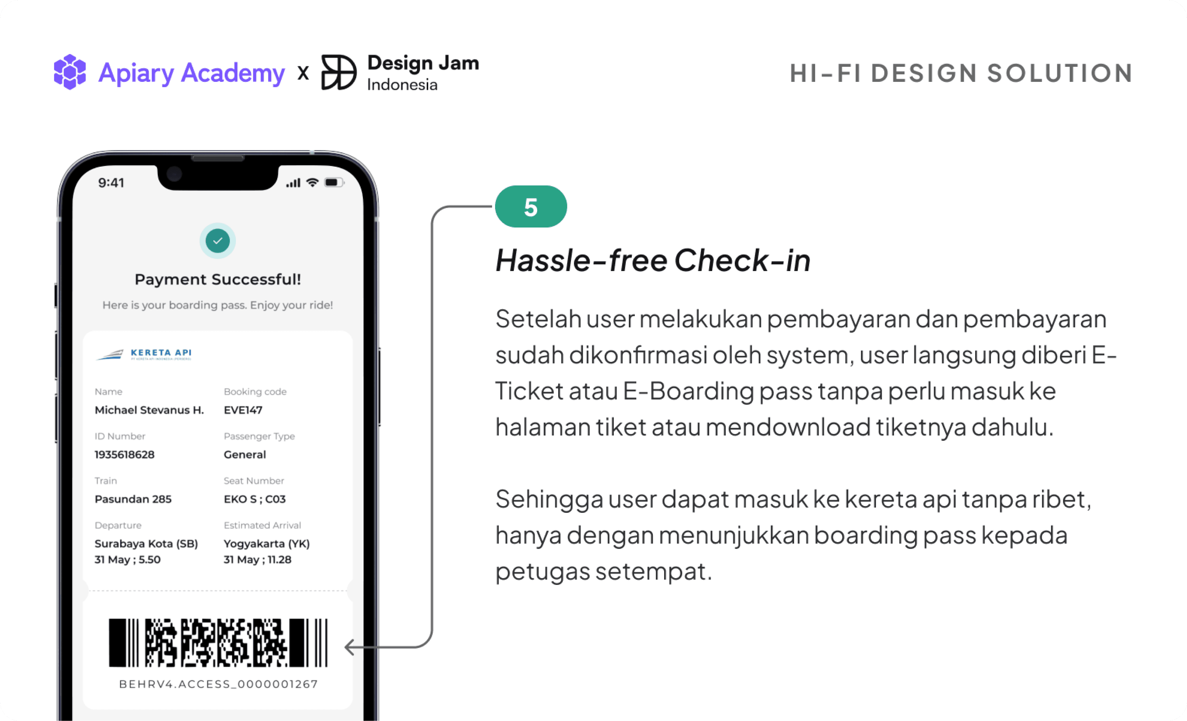
In this last solution i offered is Hassle-free Check-in. In many app i observed that after we pay several amounts of money to the ticket provider, they don’t give us the ticket directly. Usually after we pay, they direct us to the ticket page first for us to see our ticket.
For speeding up this process, i made the ticket to appear in the successful payment so the user is immediately given an E-Ticket or E-Boarding pass without the need to enter the ticket page or download the ticket first. And resulting they just need to scan it or show the boarding pass to the local officer.
