Client name
Klaus Schnurr & Mherapril Folkers
Role
UI & UX Designer
Industry
Alcohol
Software used
Figma
Overview
Problem: Inconsistent design system and no clear documentation of the project, without consistent and clear design system and documentation it can slow down the project and hinder development process.
Solution: Created 13 mobile UI screens along with a design system and style guide, which includes typography, color guides, icons, grid systems, and 18+ components. This improved the consistency of the mobile app, resulting in faster development and a smoother work process.
Impact: Streamlined workflow for UI design which results in faster design review from supervisors which are business development manager and product owner and also faster development.
Learning: Crafted design system and continously iterate it while making the product can lead to faster work process which resulting in faster approval from supervisor and developers.
Introduction
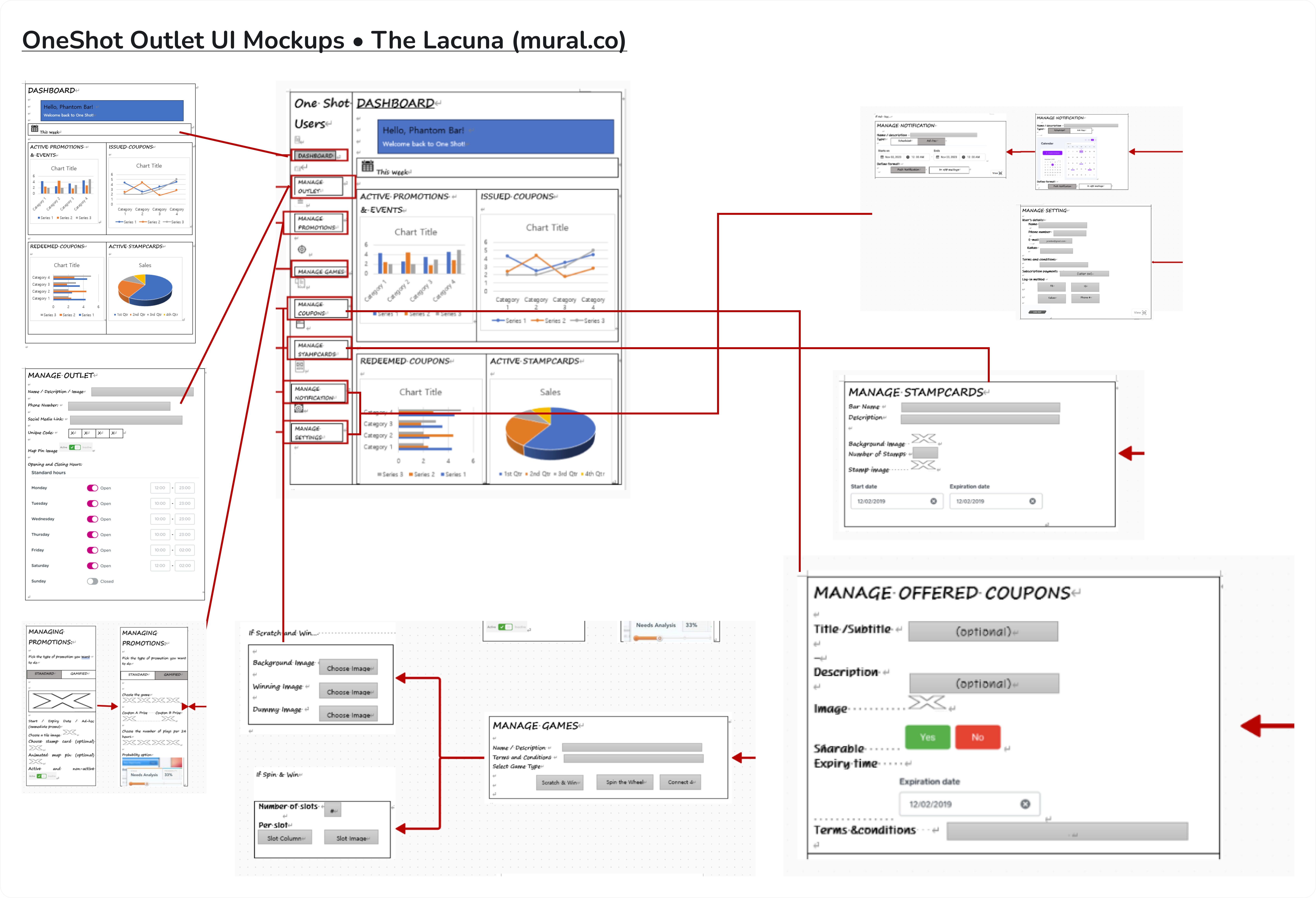
First, I want to thank my friend Didi Farizal for referring me to this project. Didi introduced me to Mheapril Folkers (April), the Business Development Manager at Rippl Technologies. After a short WhatsApp call with April and Klaus to discuss the scope of work, pricing, and working hours, we kicked off the project with a brief from April. This brief included a rough wireframe that I needed to translate into high-fidelity designs.
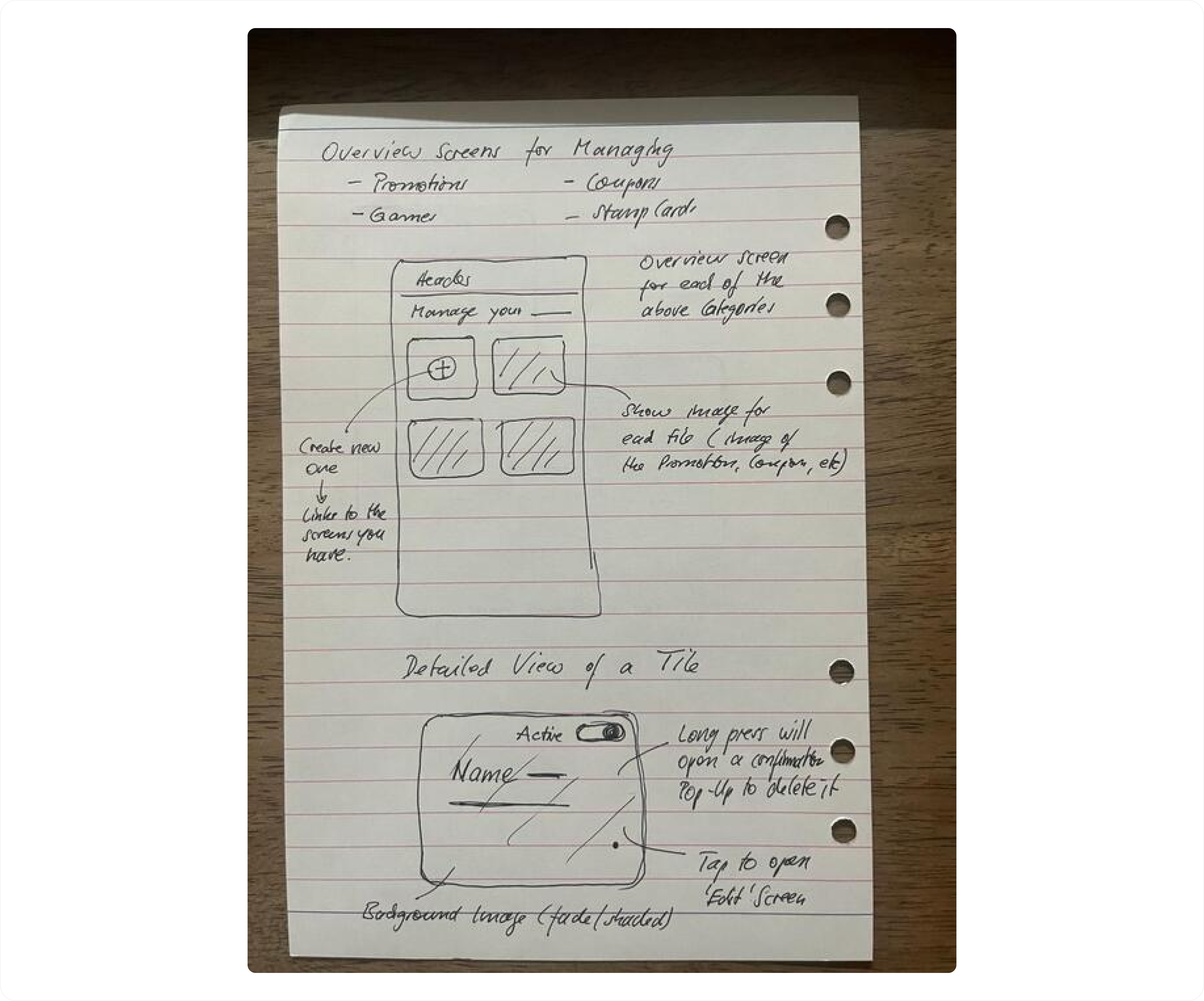
Additionally, Klaus Schnurr provided a follow-up brief for the Promotion, Games, Coupons, and Stamp Cards pages, but I only had the opportunity to work on the Promotion page.
Design Process
Initially, there was a misunderstanding. The brief looked like a desktop dashboard, so I created a desktop version. However, Klaus clarified that they needed a mobile dashboard for bar owners.
They requested 13 screens, but I realized that creating these without components would lead to inconsistencies and potential delays. To avoid this, I took the initiative to develop a mini design system, including core elements like typography, colors, icons, and a grid system for the app
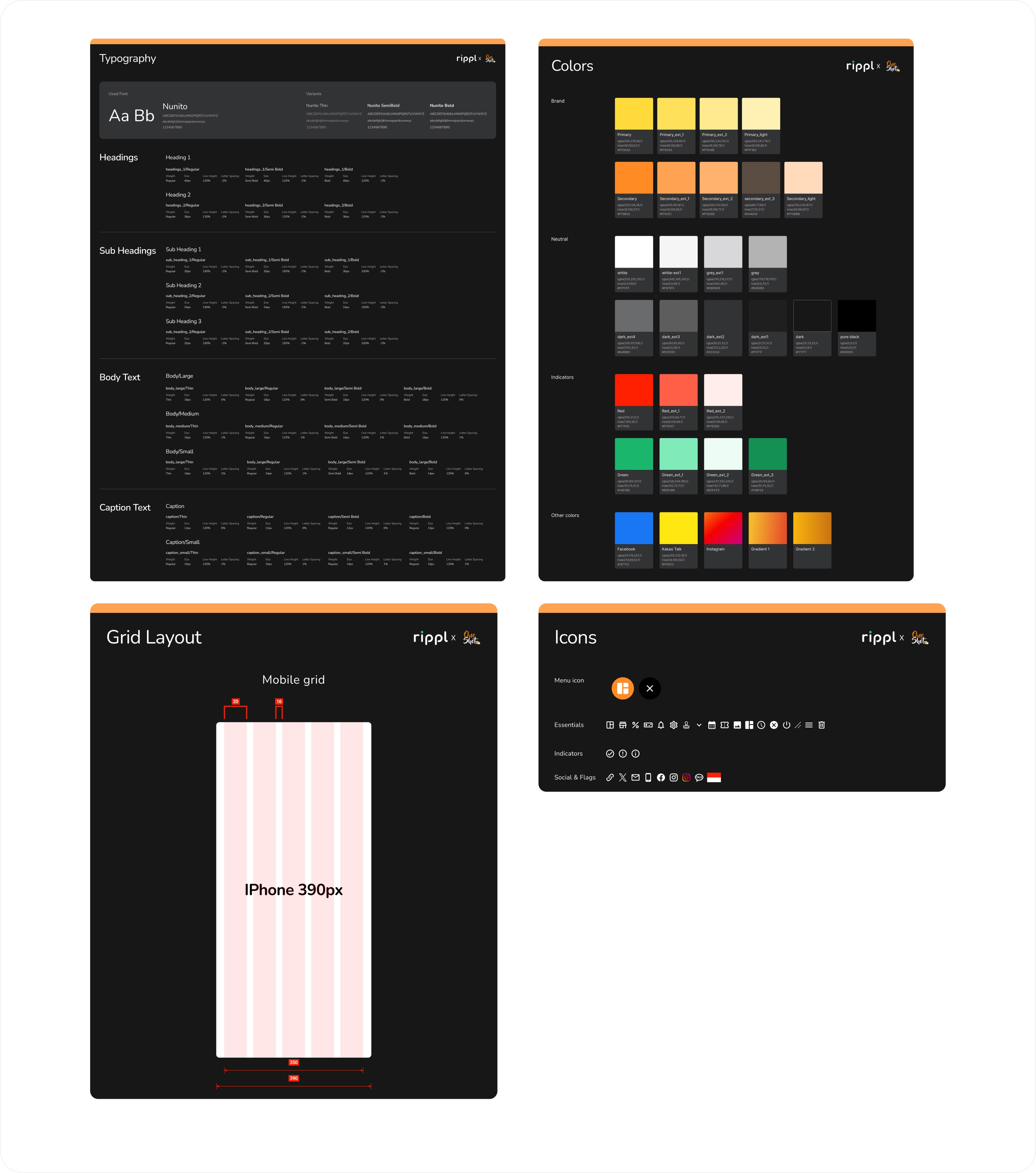
Once these core elements were established, we moved on to more complex elements such as buttons, dropdowns, and navigation bars. These elements were designed simultaneously with the mobile app, and adjustments were made as needed to meet the app requirements.
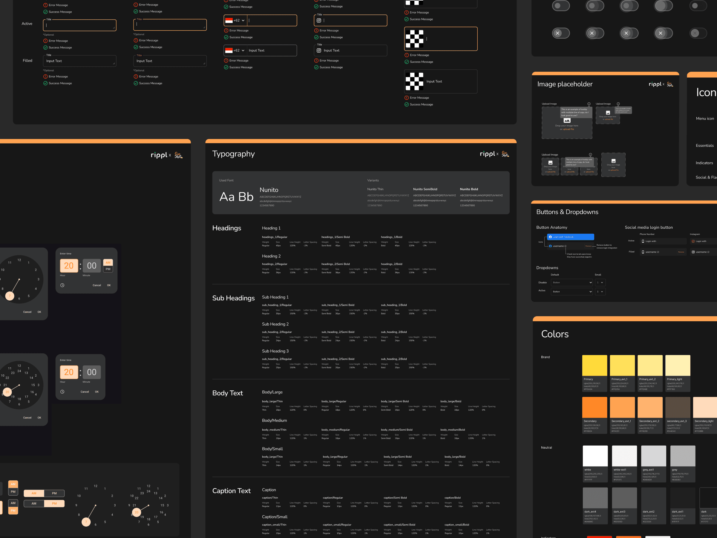
Below are the final components used for the OneShot mobile dashboard. There are nine components in total, including buttons, image placeholders, tab selectors and more.
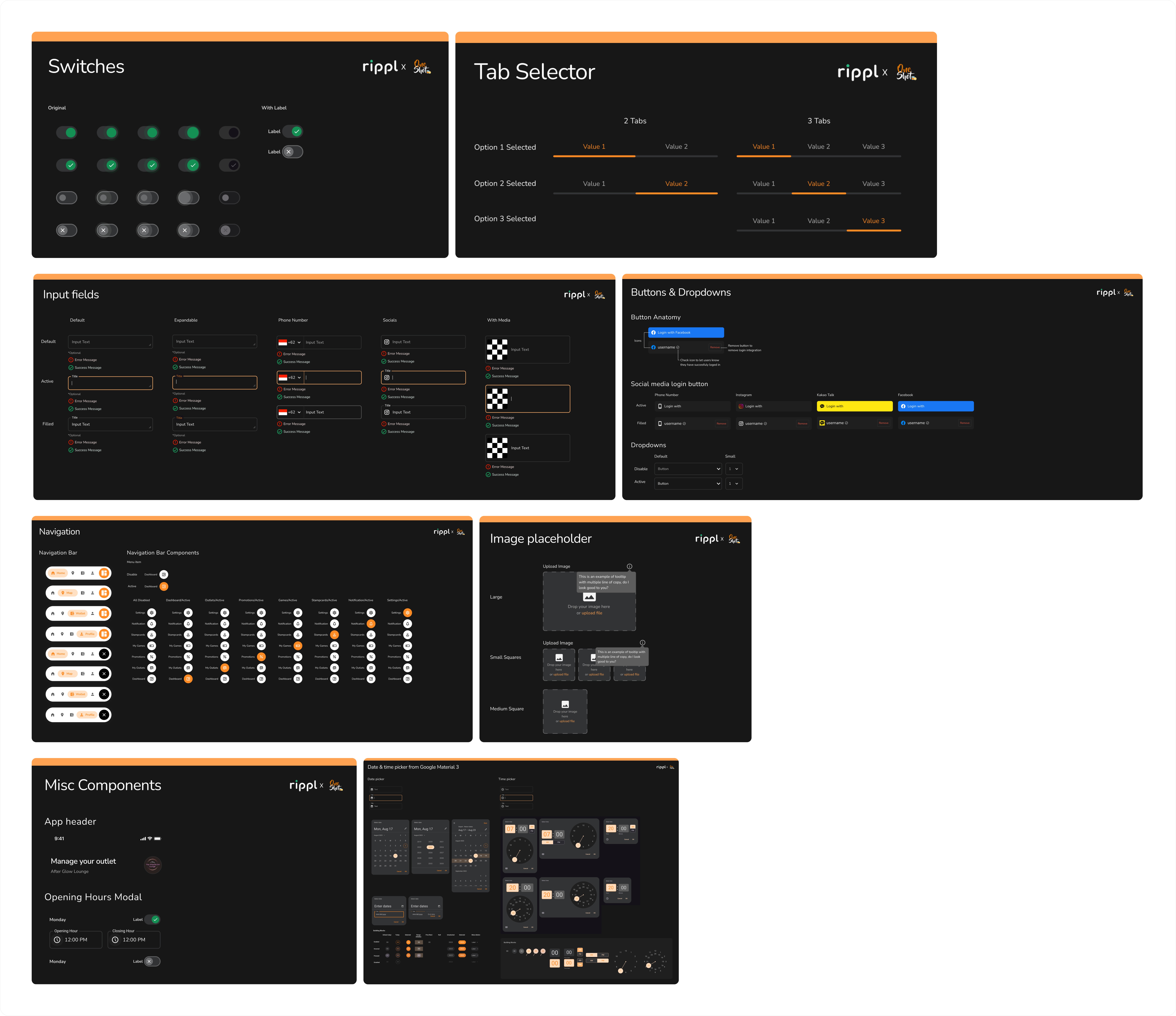
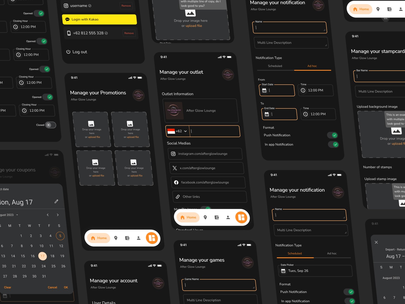
As mentioned earlier, the complex components were designed alongside the mobile app. Below is the mobile app design, showcasing the components in action. Please refer to this FigJam link for the user flow of the app.
*Note: The image placeholders have not been changed because the client did not provide the image assets.
🤩 Client's feedback
"Although there was a little problem with the communication, he was hardworking and did his best to help us with the project."
April Folkers - Business Development Manager @Rippl Technologies - Collected with Tally.so
