Client name
Octavianus Gandajaya
Role
UI & UX Designer
Industry
Education Consultant
Software used
Figma, Typedream
Overview
Problem: The previous website does not effectively showcase the owner's expertise in teaching and his collaboration with numerous organizations. Which results in not many people trusting this business and willing to make a consultation with them.
Solution: In the current or new website, we establish the brand colors which are Purple and Yellow to showcase their ambition and optimism in teaching students. Second, inserting organization logos like Binus University, Cikal School, IBox and many more. And lastly, showcasing his recent works and past works to show that Innovation Cellar's mentors are one of a kind.
Impact: Increased number of unique visitors by 7% viewed from Typedream's site analytics dashboard and a more engaging website that shows IC’s uniqueness & expertise so more people can be convinced to consult with them.
Learning: Getting more project documentation like the meetings or messages for case study documentation
Full Story
First of all, I want to thank my friend Eric Angelo for referring me to this project. So, in short Eric referred me to Octavianus or Octa for short the founder of Innovation Cellar by giving my portfolio to him.
It took quite a time for Octa to reply to my follow-up message and explain to me what kind of website he needs, the sections and deadline.
Shortly after negotiating the price and setting up the project timeline, we kickstart the project with a short meeting on Google Meet to get a clearer view of what his main goal or key activities are in making this website.

From this short meeting, Octa gave me his brief on what pages need to be done, the copywriting, image assets and some screenshot of what the previous website was like. And also, from this meeting I got some insights about his business.
The goal is to make more people consult with Innovation Cellar or IC for short
So how do I make more people interested in it? Here is what’s in my mind:
Convincing users that IC’s mentors are outstanding and one of a kind (Apple Certified Trainers with 5+ years of teaching).
And IC already worked with numerous big organizations in Indonesia such as IBox, At America, Binus School & University and more.
For the colors and typography there are also slight change:
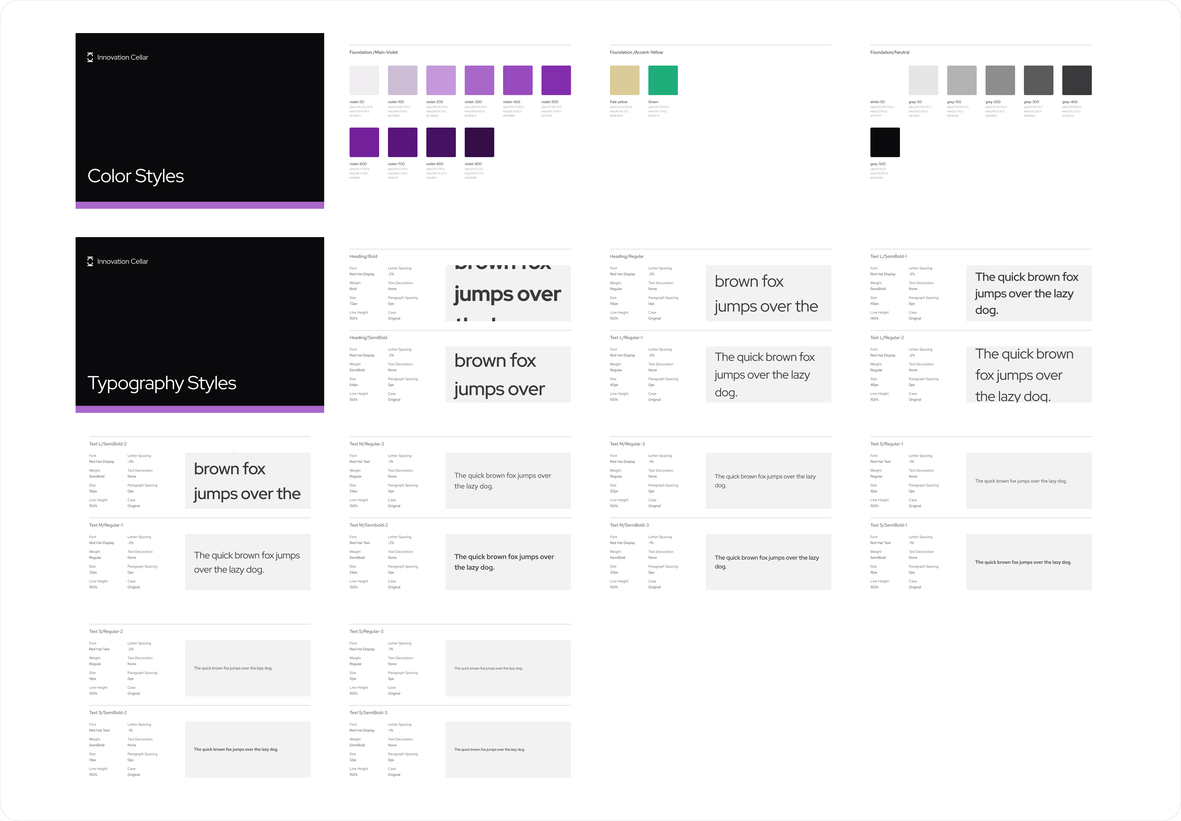
As we discuss we utilize a new color palette which is Purple & Yellow, where purple symbolizes IC’s ambition and Light yellow for its optimism and enthusiasm for teaching students and other people about Swift.
Lastly, using Red Hat Display for heading and Inter for the body.
Red Hat Display set as the heading because they make a bold statement and helpful, not too formal and not too childish perfect for Innovation Cellar that works with schools, colleges and organizations.
While Inter is used because it is a modern and clean typeface to enhance brand look into trustworthy and enhance readability which contributes to a more enjoyable user experience.
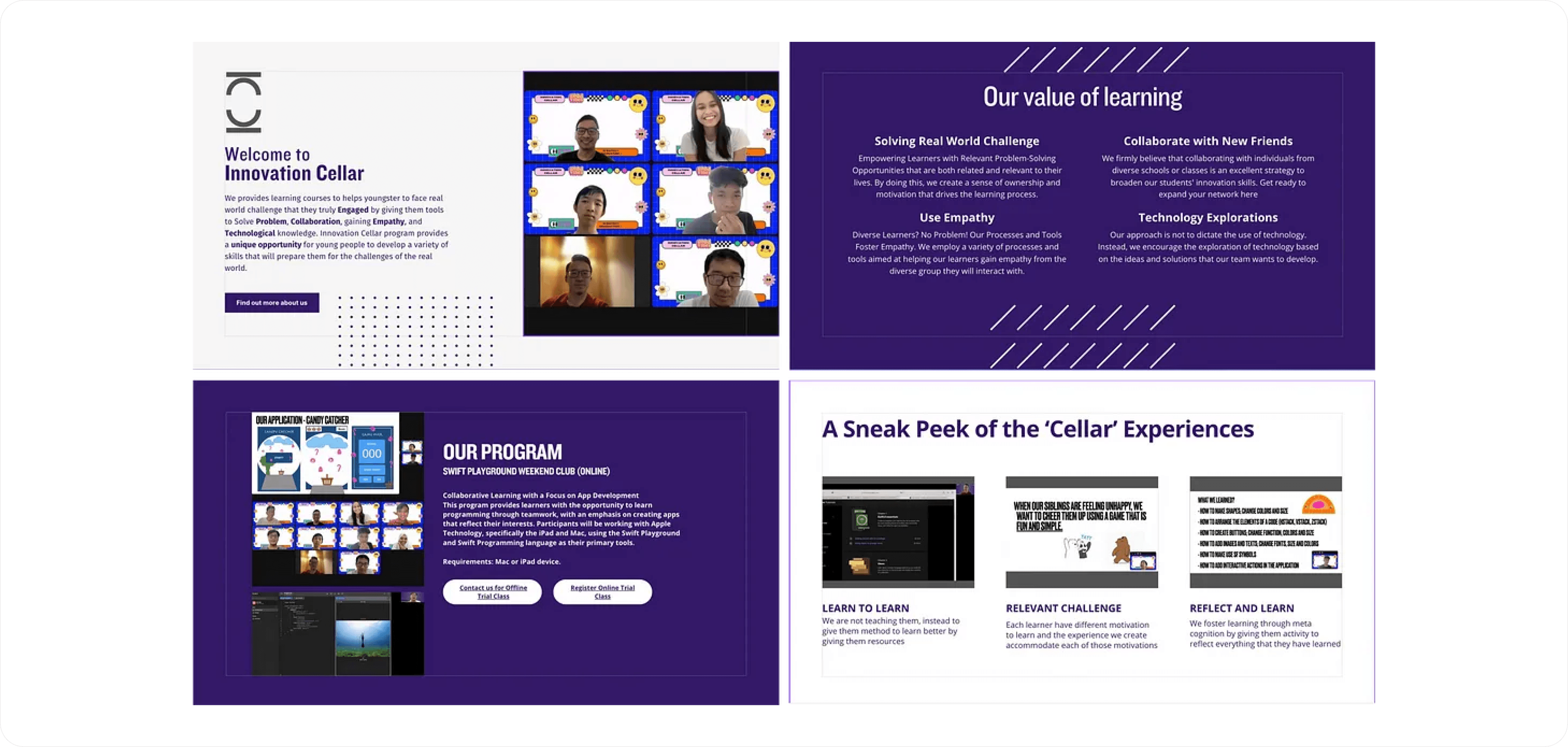
Some screenshot of the previous website
Shortly after I think the main problem I headed straight to Typedream a no-code notion like website builder. The client (Octa) requested that the website is done in Typedream, so there is no wireframe in this project I designed it in Typedream from the start.
Cooking concept on Typedream.
The first iteration of the website consists of 6 core pages which are Home, Blog & Opened Version, Past Work & Opened Version and CBL Page.
The way we want to convince users to use IC’s service is through giving past clients logos & making a blog page. Client’s logos are used to give social proof and credibility that IC already worked with numerous organizations.
Meanwhile the blog page is for users to see, read and finally understand that our mentors are truly capable in their fields. Therefore, the blog button placed second in the navigation bar. Below is the first iteration looks like 👇
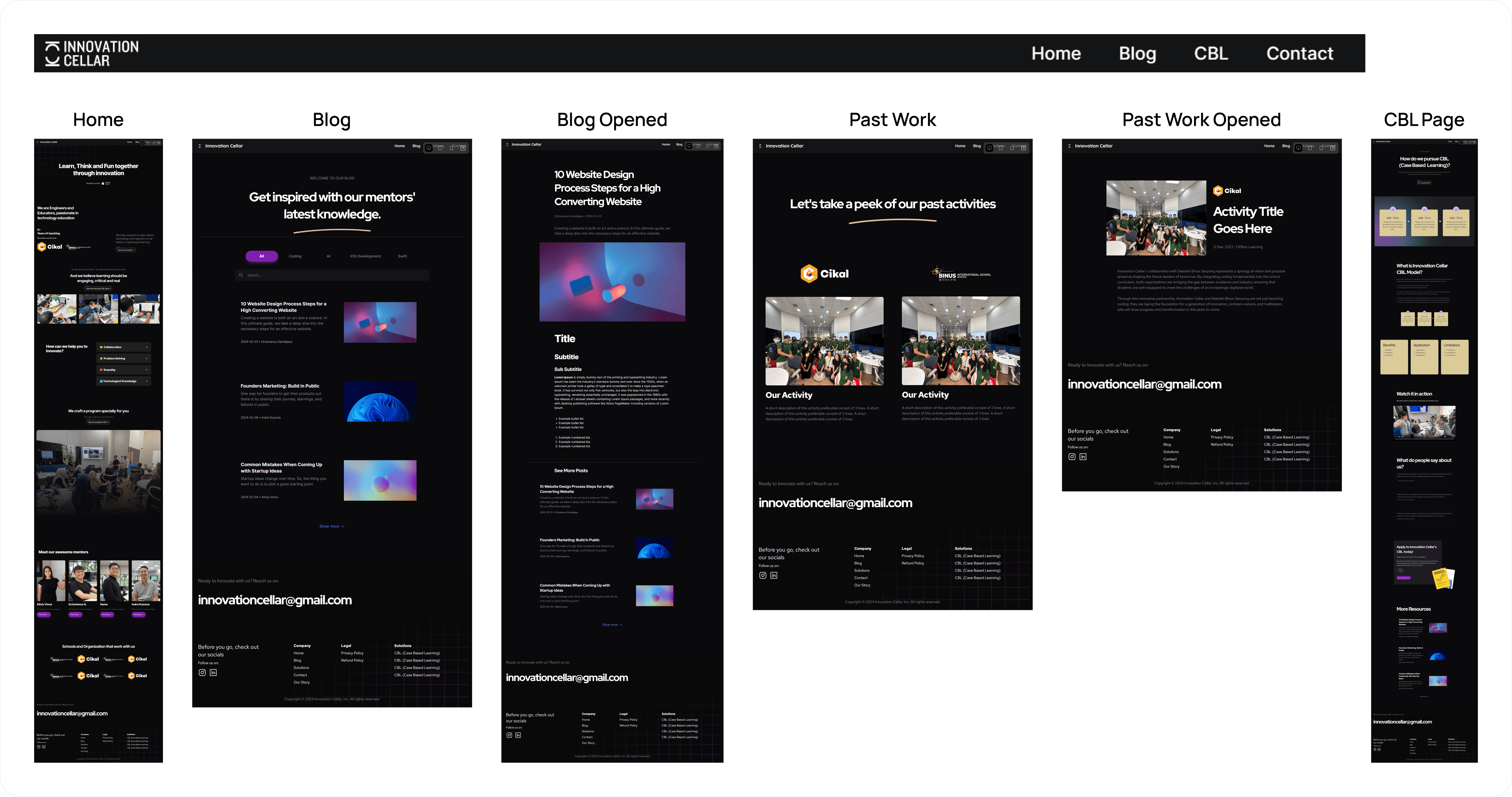
First iteration of Innovation Cellar’s Website.
Of course, this work is still far from done. On February 23, Octa needs it to be launched into a live website and so he tells me all of the organizations that they have worked with to insert their logos.
In this second iteration there are also some revisions on home page second section where i remove school logos cause of redundancy and enlarging Apple Certified Trainer (ACT) logo for their credibility.
If you ask why did i placed school logos in the first place, it is because I want to convince users other than they are ACT, they also have worked with namely schools.
But it turns out it’s not mobile friendly when i look on the mobile preview, therefore i removed it. And lastly, I changed the layout of Past Works page for easier modification. Take a peek below the new face of it below 👇
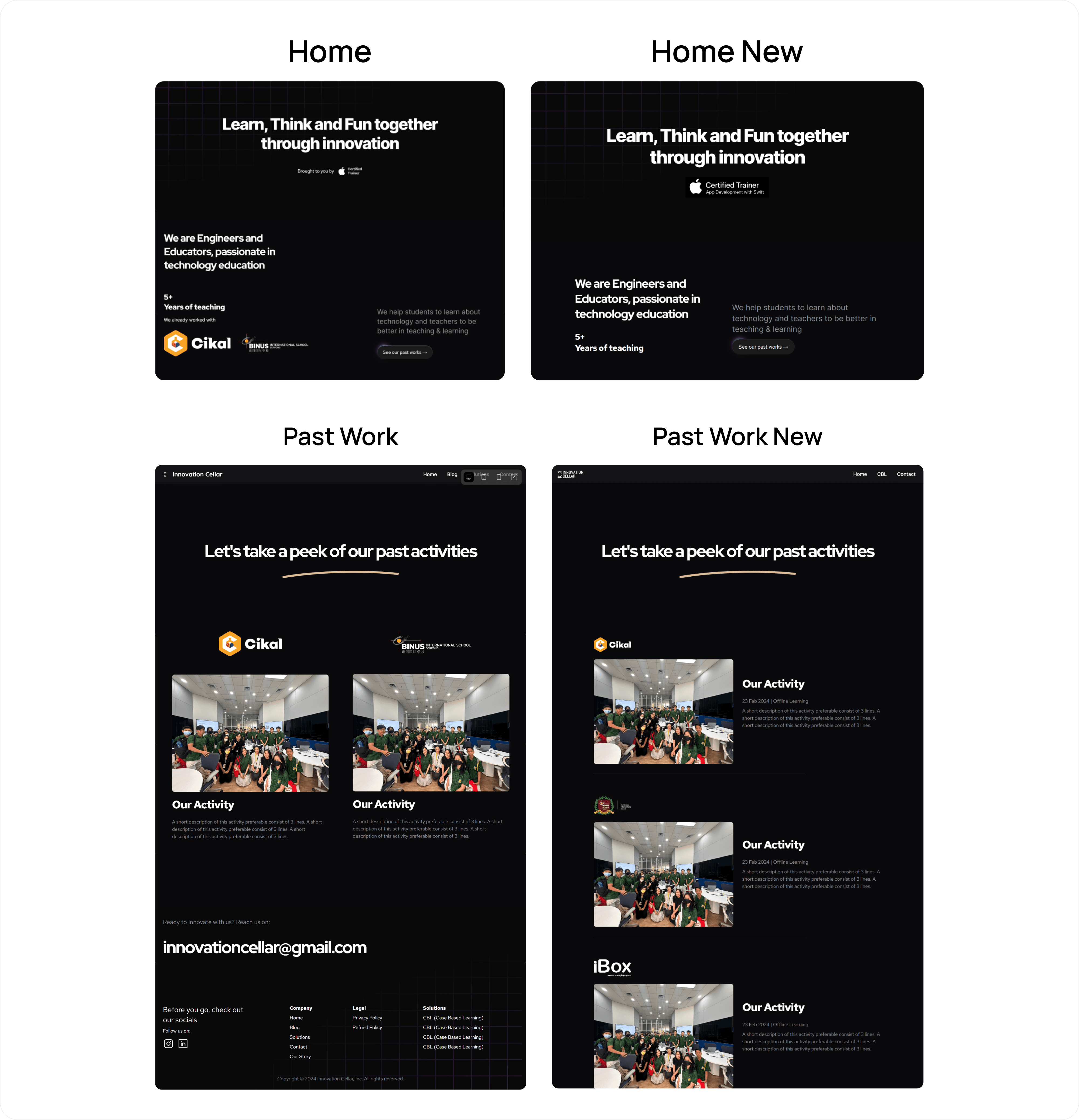
Second iteration for Innovation Cellar’s Website.
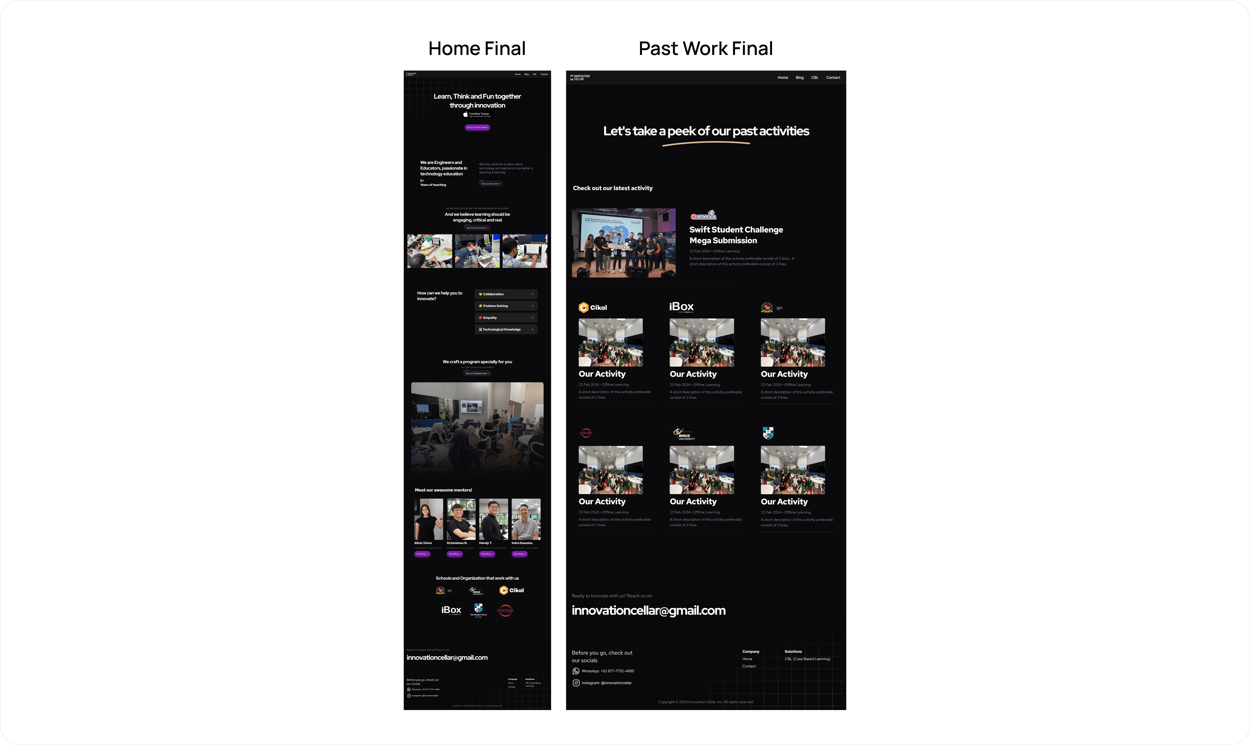
Finally, we made it to the final version. The final version is Octa wants the past work page to be more crowded, he doesn’t want just 1 activity per scroll. Therefore, I optimized the first concept to be more mobile friendly and added “our latest activity” part on the top of other activities.
The point is to highlight when the last time was, we taught or collaborated with organizations. On this final version also I just realized if his main goal is to get more people consult with Innovation Cellar, why don’t I put a CTA button on hero section to directly contact IC’s admin? Therefore, i added “Book Session” CTA below ACT logo.
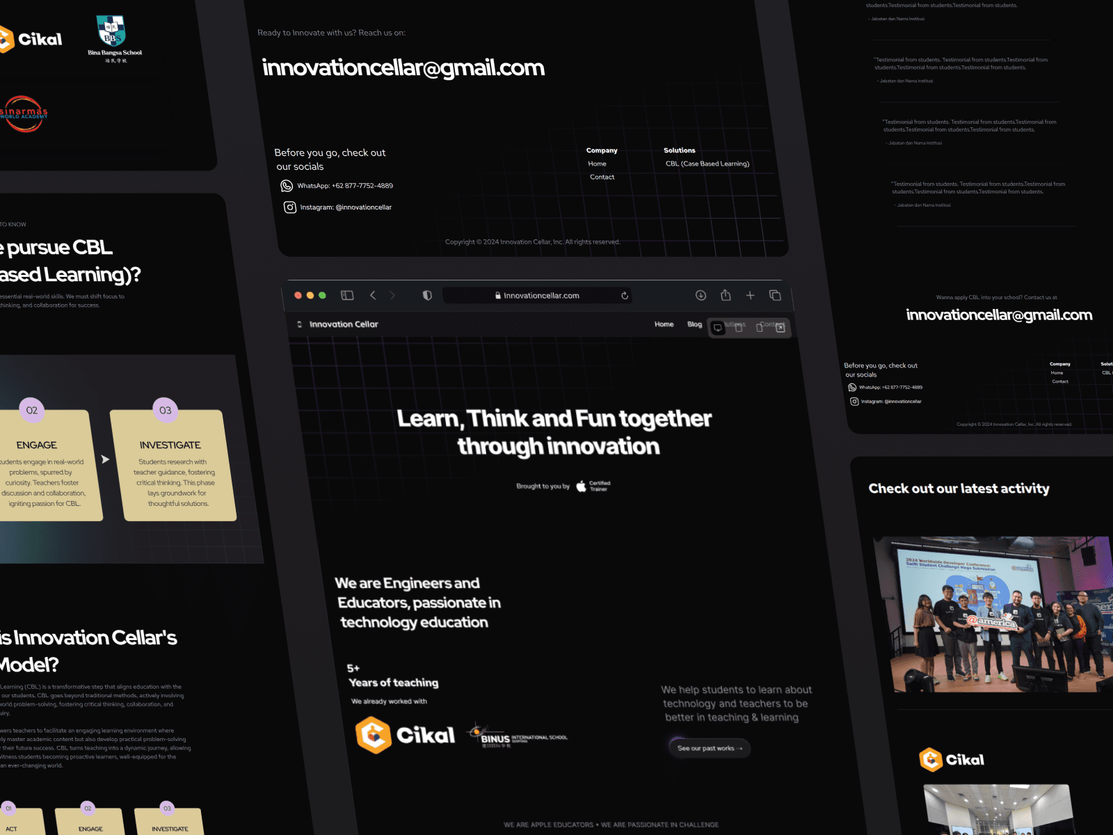
Let’s take a peek below of the final version of Innovation Cellar’s website & Style Guide documentation 👇
